TWOTHIRDS PDP REDESIGN
UX/UI
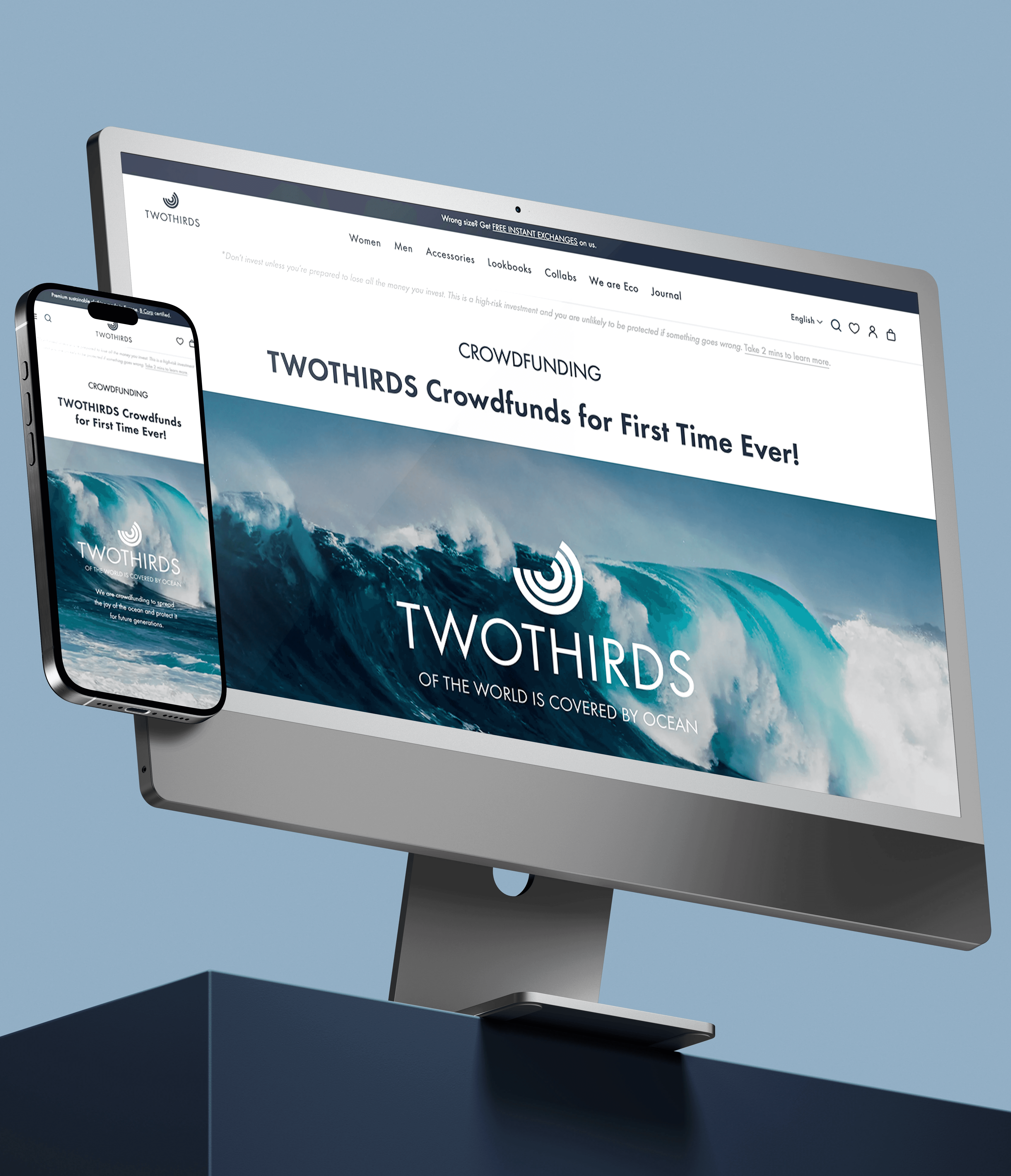
Product Page redesign to boost AOV and cross-selling. Using A/B test data, we optimized the layout by keeping 'Complete the Look' near the buy button and converting heavy product grids into space-saving sliders.
Cross-selling UX
UX/CRO OPTIMIZATION
CONVERSION-FOCUSED UX
A/B TEST & DATA ANALYSIS
LAYOUT RESTRUCTURE
Client
TWOTHIRDS
Year
2026
Field
Online-Retail
TWOTHIRDS PDP redesign
TWOTHIRDS PDP REDESIGN
UX/UI
Product Page redesign to boost AOV and cross-selling. Using A/B test data, we optimized the layout by keeping 'Complete the Look' near the buy button and converting heavy product grids into simplified cross-selling sliders.
Cross-selling UX
UX/CRO OPTIMIZATION
CONVERSION-FOCUSED UX
A/B TEST & DATA ANALYSIS
LAYOUT RESTRUCTURE
UX/CRO OPTIMIZATION
CONVERSION-FOCUSED
A/B TEST & DATA ANALYSIS
LAYOUT RESTRUCTURE
Client
TWOTHIRDS
Year
2026
Field
Online-Retail

Overview: Driving AOV Through Strategic Cross-Selling
To maximize average order value (AOV) and elevate our e-commerce performance, I led the UX/UI redesign of TWOTHIRDS' Product Detail Page (PDP).
The goal was to transform a clean but low-exposure template into a high-converting, discovery-driven experience. I designed high-fidelity mockups for both desktop and mobile in Figma, introducing strategic cross-selling zones to capture customer intent early in the shopping journey.
Key Improvements
Strategic Content Hierarchy: Positioned the high-converting "Complete the Look" module early in the scroll, directly underneath the product description, to capture intent immediately.
Category Slider & Discovery Grid: Following industry benchmark practices, we introduced a horizontal slider with products of the same category alongside a prominent "You Might Also Like" grid to encourage discovery.
Dynamic Mobile Sticky CTA: The original sticky buy bar triggers only after the primary CTA scrolls out of the user's viewport. This maximizes mobile screen space and minimizes clicks to cart.
Our 4-week mobile A/B test revealed a classic "Paradox of Choice." While the heavy product grids successfully drove exploration, they caused decision fatigue and distracted users from completing their purchases:
Product Grid Interaction: +20.41% (significantly increased exploration)
Average Order Value (AOV): -5.63%
Conversion Drop: Core transaction metrics and checkout initiations performed lower than the original control template.
Instead of pushing an underperforming layout, we executed a rapid, data-driven pivot. We reverted to the clean original template to protect baseline conversion rates, but integrated our two highest-performing assets: the "Complete the Look"module and the Smart Mobile Sticky CTA.
This optimized, hybrid layout successfully achieved the ultimate balance between exploration and conversion:
Conversion Recovery: Reverting to the original structure fully restored our baseline conversion rates and eliminated cart instability.
Sticky CTA Impact: By showing the sticky bar only after the main CTA disappeared from view, we reduced checkout friction and boosted mobile Add-to-Cart (ATC) rates by +12%.
High-Value Discovery: Retaining "Complete the Look" early in the scroll maintained strong AOV support without causing user distraction.
Results
Our 4-week mobile A/B test revealed a classic "Paradox of Choice." While the heavy product grids successfully drove exploration, they caused decision fatigue and distracted users from completing their purchases:
Product Grid Interaction: +20.41% (significantly increased exploration)
Average Order Value (AOV): -5.63%
Conversion Drop: Core transaction metrics and checkout initiations performed lower than the original control template.
Instead of pushing an underperforming layout, we executed a rapid, data-driven pivot. We reverted to the clean original template to protect baseline conversion rates, but integrated our two highest-performing assets: the "Complete the Look"module and the Smart Mobile Sticky CTA.
This optimized, hybrid layout successfully achieved the ultimate balance between exploration and conversion:
Conversion Recovery: Reverting to the original structure fully restored our baseline conversion rates and eliminated cart instability.
Sticky CTA Impact: By showing the sticky bar only after the main CTA disappeared from view, we reduced checkout friction and boosted mobile Add-to-Cart (ATC) rates by +12%.
High-Value Discovery: Retaining "Complete the Look" early in the scroll maintained strong AOV support without causing user distraction.
Results
The Starting Point
Our original PDP featured a highly simplified layout with only two immediate cross-selling opportunities (1) "You may also like".


Original PDP


New PDP
To tackle this, we designed an extensive new layout featuring multiple cross-selling such as adding a (1) "Complete the Look," right after the product description, (2) "Similar Products," and changing the original "You may also like" slider to a (3) vertical product grid.
While the desktop description and CTA version was kept with no updates, the mobile version was adapted to the desktop layout, showing CTA shopping button instead of showing the sticky bar early on the PDP.
Overview: Driving AOV Through Strategic Cross-Selling
To maximize average order value (AOV) and elevate our e-commerce performance, along with the Growth and Development teams, I led the UX/UI redesign of TWOTHIRDS' Product Detail Page (PDP).
The goal was to transform a clean but low-exposure template into a high-converting, discovery-driven experience. I designed high-fidelity mockups for both desktop and mobile in Figma, introducing strategic cross-selling zones to capture customer intent early in the shopping journey.
The Starting Point
Our original PDP featured a highly simplified layout with only two immediate cross-selling opportunities (1) "You may also like".
To tackle this, we designed an extensive new layout featuring multiple cross-selling such as adding a (2) "Complete the Look," right after the product description, (3) "Similar Products," and changing the original "You may also like" slider to a (4) vertical product grid.
While the desktop description and CTA version was kept with no updates, the new mobile version was adapted to the desktop layout, showing CTA shopping button instead of showing the sticky bar early on the PDP.
Our original PDP featured a highly simplified layout with only two immediate cross-selling opportunities (1) "You may also like".
To tackle this, we designed an extensive new layout featuring multiple cross-selling such as adding a (2) "Complete the Look," right after the product description, (3) "Similar Products," and changing the original "You may also like" slider to a (4) vertical product grid.
While the desktop description and CTA version was kept with no updates, the new mobile version was adapted to the desktop layout, showing CTA shopping button instead of showing the sticky bar early on the PDP.
Original PDP
Original PDP

New PDP
New PDP
Key Improvements
Strategic Content Hierarchy: Positioned the high-converting "Complete the Look" module early in the scroll, directly underneath the product description, to capture intent immediately.
Category Slider & Discovery Grid: Following industry benchmark practices, we introduced a horizontal slider with products of the same category alongside a prominent "You Might Also Like" grid to encourage discovery.
Dynamic Mobile Sticky CTA: The original sticky buy bar triggers only after the primary CTA scrolls out of the user's viewport. This maximizes mobile screen space and minimizes clicks to cart.
Results
Our 4-week mobile A/B test revealed a classic "Paradox of Choice." While the heavy product grids successfully drove exploration, they caused decision fatigue and distracted users from completing their purchases:
Product Grid Interaction: +20.41% (significantly increased exploration)
Average Order Value (AOV): -5.63%
Conversion Drop: Core transaction metrics and checkout initiations performed lower than the original control template.
Instead of pushing an underperforming layout, we executed a rapid, data-driven pivot. We reverted to the clean original template to protect baseline conversion rates, but integrated our two highest-performing assets: the "Complete the Look"module and the Smart Mobile Sticky CTA.
This optimized, hybrid layout successfully achieved the ultimate balance between exploration and conversion:
Conversion Recovery: Reverting to the original structure fully restored our baseline conversion rates and eliminated cart instability.
Sticky CTA Impact: By showing the sticky bar only after the main CTA disappeared from view, we reduced checkout friction and boosted mobile Add-to-Cart (ATC) rates by +12%.
High-Value Discovery: Retaining "Complete the Look" early in the scroll maintained strong AOV support without causing user distraction.