TWOTHIRDS CROWDFUNDING
TWOTHIRDS CROWDFUNDING
TWOTHIRDS CROWDFUNDING
UX/UI
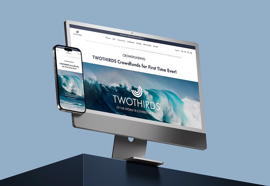
Designed and developed a conversion-focused landing page for TWOTHIRDS’ crowdfunding campaign, transforming complex investment information into a clear and engaging experience that supported a campaign reaching 113% funding on Crowdcube.
Landing Page Design
WIREFRAMING
CONTENT
VISUALS
IMPLEMENT
Client
TWOTHIRDS
Year
2024
Field
Online-Retail
Desktop
I handled both the visual design and web implementation for the desktop version, ensuring fidelity to the original wireframe and optimized user experience.
Impact
+113%
Supported a successfully overfunded crowdfunding campaign (113% funded)
Hierarchy
Improved clarity and scannability of investment-related content through structured UX and visual hierarchy.
Conversion
Designed conversion-focused user flows with strategic CTA placement across the experience.
Mobile
Additionally, I created the wireframe and adapted key elements for the responsive version.
Overview
Starting from the client’s copy, I broke the content into thematic blocks and created a wireframe. I transformed key parts of the text into icons and visual elements to improve clarity and user engagement.
To ensure smooth navigation and quick conversions, each section featured a clear call-to-action (CTA) linking directly to the official crowdfunding platform, reducing information overload while maintaining momentum.

Desktop
I handled both the visual design and web implementation for the desktop version, ensuring fidelity to the original wireframe and optimized user experience.
Mobile
Additionally, I created the wireframe and adapted key elements for the responsive version.
Impact
+113%
Supported a successfully overfunded crowdfunding campaign (113% funded)
Hierarchy
Improved clarity and scannability of investment-related content through structured UX and visual hierarchy.
Conversion
Designed conversion-focused user flows with strategic CTA placement across the experience.
+113%
Supported a successfully overfunded crowdfunding campaign (113% funded)
Hierarchy
Improved clarity and scannability of investment-related content through structured UX and visual hierarchy.
Conversion
Designed conversion-focused user flows with strategic CTA placement across the experience.
Content Analysis & Wireframing
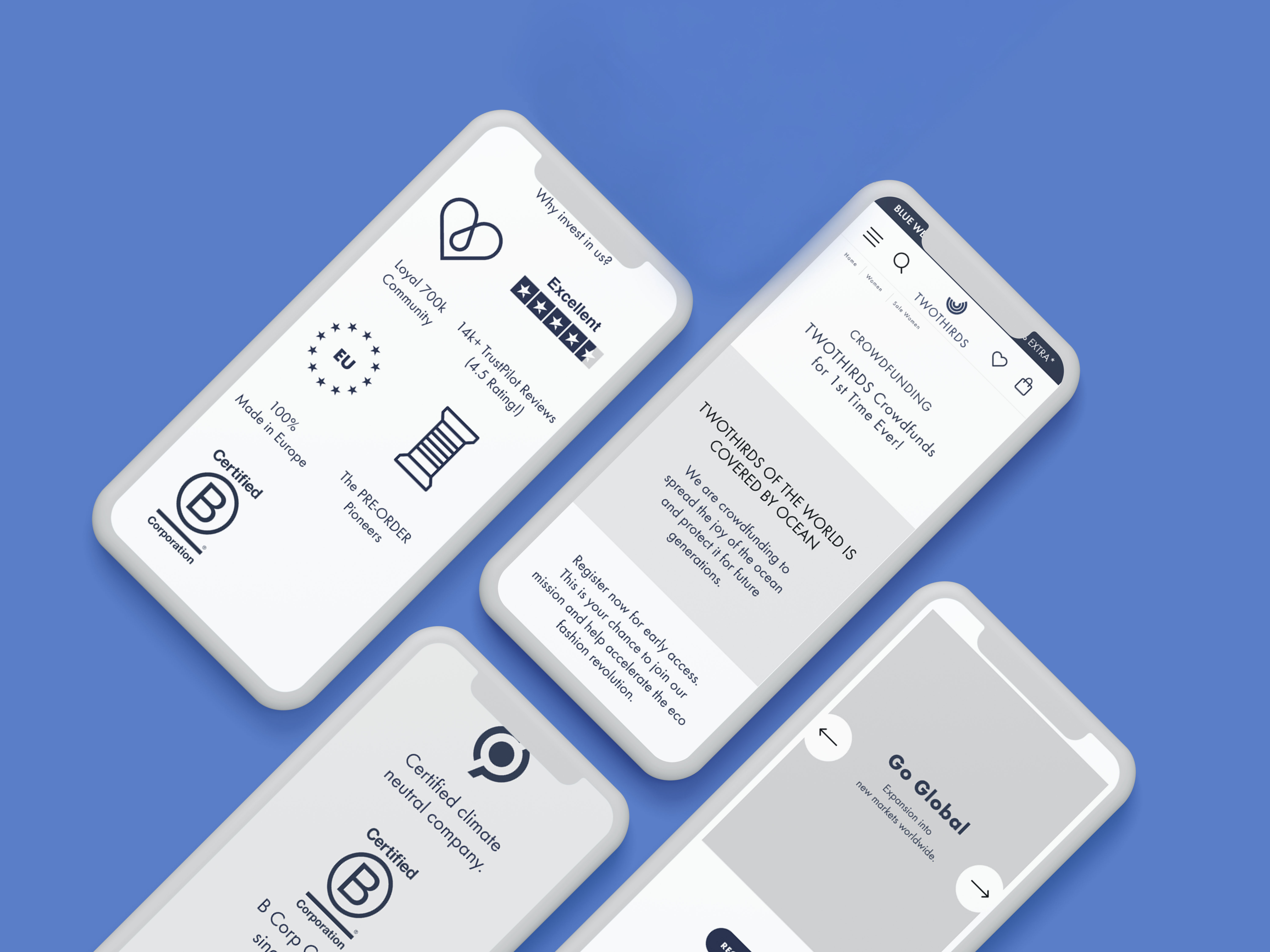
Starting from the client’s copy, I broke the content into thematic blocks and created a wireframe. I transformed key parts of the text into icons and visual elements to improve clarity and user engagement.
To ensure smooth navigation and quick conversions, each section featured a clear call-to-action (CTA) linking directly to the official crowdfunding platform, reducing information overload while maintaining momentum.